UI/UX Case Study: Re-imagining how Instagram displays hashtags
From influencers and brands to casual users, we have all come to spend a lot of time composing(and regretting) our posts and captions. In this article, we’ll be talking about hashtags. Hashtags are extremely useful tools for several reasons. They allow us to:
∙ Gain exposure and engagement from new audiences for our content and accounts. For brands and influencers, this is critical to increase your following, sales and paid partnerships. After all, posts with at least one hashtag receive, on average, 12.6% more engagement.
∙ Discover new accounts with content we’re interested in.
∙ For Instagram itself, the amount of people engaging with the app is directly proportional to the quality of intrinsic value being developed within the platform. Hashtags facilitate this engagement by distributing content via previously mentioned means. This also means that hashtags must be easily found by content viewers as to allow the cycle of distribution to work effectively.
To clarify, Instagram wants users to use hashtags. Influencers want to use hashtags. Brands want to use hashtags. Casual users want to use hashtags (who doesn’t love likes, followers and more validation from our peers?) However, there are a few key issues that exist causing friction and discomfort for all user groups, ultimately repressing hashtag usage.
Understanding the challenge: Overview
As mentioned, influencers and brands use hashtags to increase their exposure, engagement, following, sales and paid partnerships. If you were to scroll through your favorite creator’s content, you will surely notice them hiding their voluminous use of hashtags (up to 30 allowed in a single post). Originally, hashtags were placed in the content’s caption, but users quickly discovered that a large list of 30 tags creates a self-promotional and spammy aesthetic like @barclay_and_co’s post below.

Users quickly discovered discreet ways of hiding their big blue block of tags. Here is an example of how @jimmysongcreative and today’s influencers and brands like their content to look.
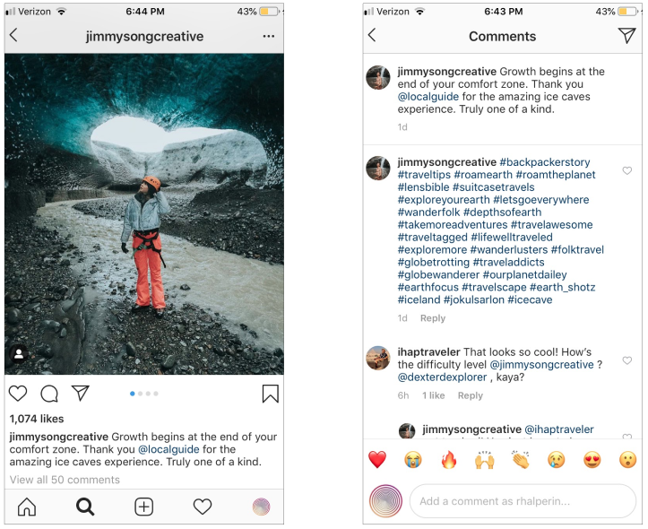
Clean and simple. A substantial amount of users are removing their tags from display by adding them as a comment after the content is posted as seen in the image below. Once a couple of users comment on the post, the tags are hidden from view. This allows influencers and brands to maintain a clean look without the distracting promotional material.
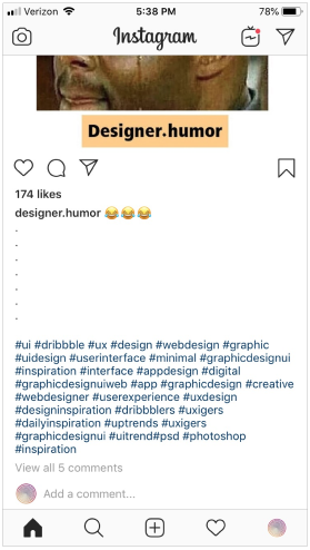
Another method frequently used is to exploit the “…more” feature. When captions become too long or, in this case, when users add a myriad of new lines and periods or dashes, the text, “…more” appears. This text appears between the caption and the new lines, effectively hiding the elongated formatting as well as the tags. After tapping “…more”, the full caption expands just like the post from @designer.humor.
Among casual users, using several hashtags does not sit well. Casual users are embarrassed to use several hashtags. They often view it as “desperately seeking attention” and “pandering for likes”. Nobody wants to be seen as an attention seeker, therefore this social behavior dissuades users and keeps tag usage to a minimum.
It is clear through observing user behavior as well as the plethora of online guides instructing how to hide hashtags, users do not love how it makes their content look.
The Process: Interviews & Insights
After observing these behaviors, I developed a set of interview questions. The purpose was to determine the basic ‘pain-points’ of Instagram content creators when it comes to including hashtags with their content. I interviewed influencers, brands as well as casual users to get their perspectives of what was going on here. My questions revolved around a few key topics:
∙ Customer segmentation: Is this person a part of my target audience/demographic? If so, what kind of user are they? How do they currently use the product?
∙ Problem Discovery: What challenges do they face?
∙ Problem Validation: Do they face the challenges I think they have?
∙ Product Discovery: Idea generation
∙ Product Validation: Idea validation/invalidation
Insights gathered:
3 types of users:
∙ Influencer: an individual with a large audience that uses their leverage to partner with and promote brands’ products and/or services.
∙ Brand: a business entity showcasing their brand and selling products and/or services.
∙ Casual: Instagram hobbyists that use the platform to socialize with friends.
Influencers & Brands:
∙ Need to post social media content consistently. Instagram is usually the most important platform for them at the moment.
∙ Enjoy a clean and minimalistic aesthetic with their content as it relates to captions.
∙ Believe it’s important to be able to appear organized and maintain their image.
∙ Want to use all 30 tags, but don’t want to shove them in from of their audiences’ faces and appear spammy.
∙ Actively pursuing more engagement, followers, sales and paid partnerships.
∙ Primarily only use in-caption tags to communicate slogans, other marketing materials or humor.
Casual:
∙ Use tags in captions sparingly, typically 1–5.
∙ Embarrassed to be seen using too many tags in their content.
∙ They often feel judged as “desperately seeking attention” and “pandering for likes”.
∙ Upon having these discussions, it became clear that influencers and brands and casual users definitely disliked having their tags showcased to their audience. They’ve seen many accounts using the same tactics described in the overview, which is often how they learn of them. This issue is important enough to them that they go out of their way to using clever workarounds to achieve their desired look.
The Process: Current Platform Examination

Moving forward, I scrutinized the ways Instagram currently organizes both its hashtags as well as individuals who have been tagged in content. I became interested in what I believe is a relatively new feature. Pay attention to the person shaped icon in the bottom left-hand corner. This icon appears in video content when the content creator tags another creator. Tapping this icon pulls up the In This Video tab (below), allowing us to see who else is affiliated or tagged within this post.
Here we see the In This Video tab. This feature served as an example of relocating tag-like content and was the primary piece of inspiration for my design solutions.


@r1motorsport’s post of a Porsche contains the photo version (as opposed to video) of the previous icon seen in the photo of the Ferrari (🤤). Tapping the photo reveals the tags you see placed across the image. There is no tab that pulls up like we saw before. If we were to include hashtags in a display like this, it would be chaotic and would be as much, if not more, of a visual nuisance than the current hashtag display feature set. Imagine 30 tags scattered across this photo… no thanks.
It makes more sense to do this when tagging individuals because there is still a useful use case. For example, imagine taking a group photo. You can place the tags on the appropriate people so viewers will know who is who. But hashtags don’t often have that use case, thus would be inappropriate and a poor design decision.
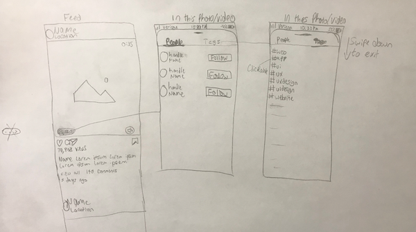
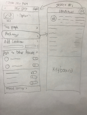
The Process: Wireframe sketches
This was the first step to help me outline the app and visually imagine it.
Next, the fun part: the Conclusion, filled with coffee and music-infused prototyping!
Let’s begin the tour: Final Design
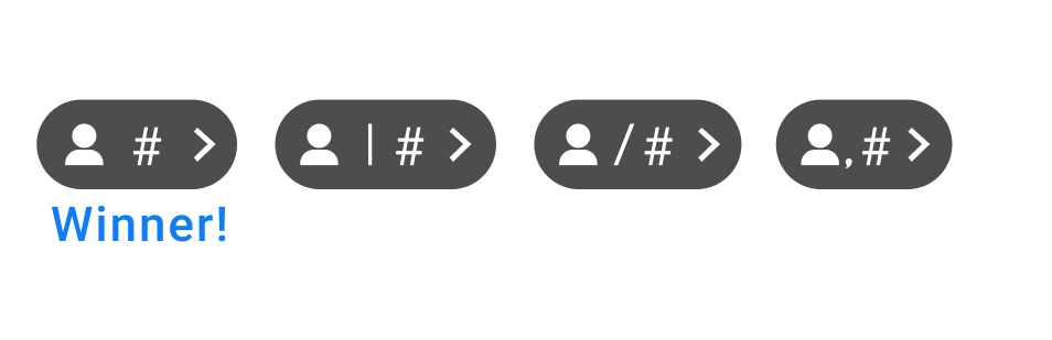
The Tags Icon:
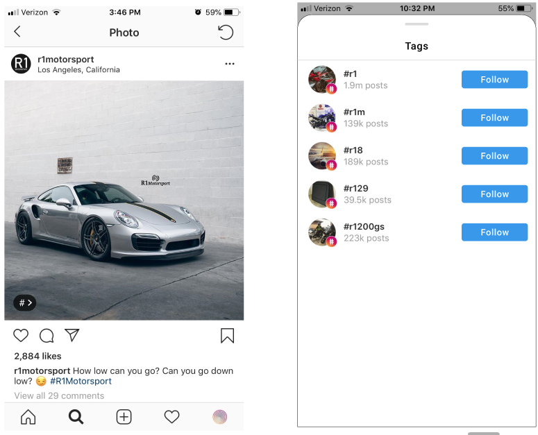
Referring back to the photo with the Ferarri (🤤), I kept a consistent, but updated look for our first stop: the Tags Icon. After making a few versions of this icon, I sent a survey to several Instagram users for them to vote on their favorite variation. The winning icon was the minimalistic design below, without any ancillary elements.

Using that feedback, I implemented it into Instagram’s current feed layout seen in the lower left-hand corner of the photo (left). Here we can see Gestalt’s principle of Focal Point in play.
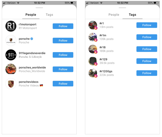
Tag Tab:
Here we have a subtle, yet effective change to the previous In This Video tab. I’ve added the ability for users simply swipe to change from tagged people to hashtags. This page is activated by hitting the Tags Icon. Gestalt’s principles of Similarity, Proximity and Common Region are apparent here.
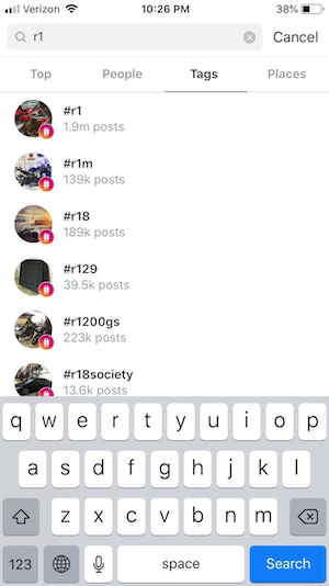
Instagram had previously created a layout (left) for a hashtag search feature that held a lot of synergy with the Tag Tab’s purpose. It is here where I re-used some design elements in order to maintain consistency within the app.
What about when only hashtags are used or only people are tagged? The appropriate Tag Icon is used (people, hashtags, or people and hashtags). After tapping the icon, the relevant tab pulls up. This is done to keep the design consistent with Instagram’s theme of minimalism. If there aren’t any people tagged in the photo, it wouldn’t make sense for users to swipe back in forth between the two tag types.
Lastly, all this conversation about hashtags is useless if we don’t have a way to add them to the Tag Tab in the first place. Hashtags are traditionally added at time of content creation. We’re going to keep it that way with another subtle, yet effective “Hashtags” section. Tapping anywhere in that region will open the hashtags screen to the right.
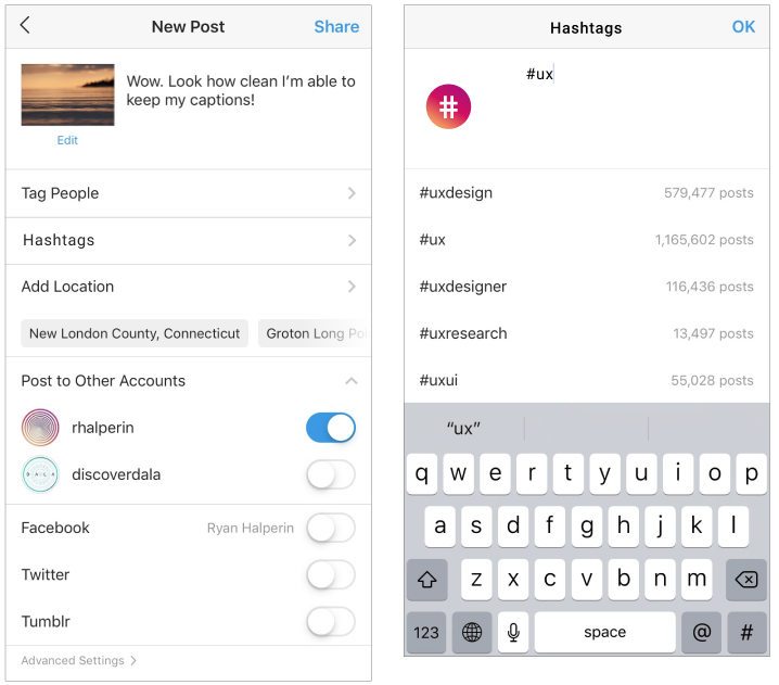
As the user types in their desired tags, an auto-complete feature populates the remaining white space to make tag recommendations and help users find tags they may be searching for just as Instagram does when adding tags to a caption. Using this feature places these tags in the Tag Tab just as tagging people currently places them in the In This Video Tab.
You may have also noticed the hashtag logo utilizing Instagram’s logo color gradient. This was added to balance the caption creation and tag creation interfaces.
Summary
Hashtags play a critical role in distributing content amongst users and increasing engagement metrics. However, I believe Instagram’s current designs repress hashtag use, inhibit overall content distribution amongst users and ultimately lower the platform’s intrinsic value for influencers, brands and casual users. How?
∙ Hashtags are an eyesore for content creators and viewers.
∙ They prevent influencers and brands from maintaining a clean and minimal appeal with their content as it relates to their captions.
∙ Influencers and brands are frequently taking measures to hide their hashtags from their audience’s view to avoid a self-promotional and spammy aesthetics.
∙ Casual users feel embarrassed about including hashtags with their content due to being judged as “desperately seeking attention” and “pandering for likes”.
I believe that these design updates will accomplish several things:
∙ Users will no longer have to use clever tricks to avoid spammy looking captions and comments. This is valuable because influencers and brands spend a lot of time curating their Instagram pages. They use this platform as significant part of their marketing strategies and should be able to reflect their brand as much as possible.
∙ Hashtags are moved into the same tab that Instagram currently puts tagged users in within video content posts. In doing so, tags are not distracting viewers from a post’s content while remaining easy to find.
∙ Casual users are more likely to use more tags as it is not as apparent to their judgmental viewers.
All of these factors will (hopefully) increase hashtag usage amongst all three types of users, boosting content distribution and intrinsic platform value.