Community Brands offers job boards as a service to various non-profits' and associations' websites, such as American Physical Therapy Association. A service within the job boards is the Career Coaching page, where job seekers can reach out to coaches for career advice.
I was tasked with creating mockups that bring the Career Coaching page into the 21st century regarding aesthetics and usability while using a mobile-first approach. This design aims to reduce the amount of time spent browsing and familiarizing themselves with each coach's background and expertise. The goal is to help users quickly answer "who is this and how can they help me".
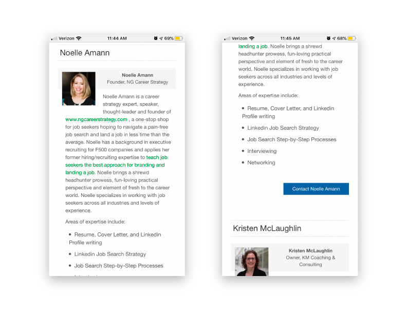
The Legacy Design
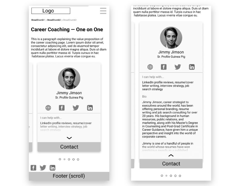
The Updated Coach Profile
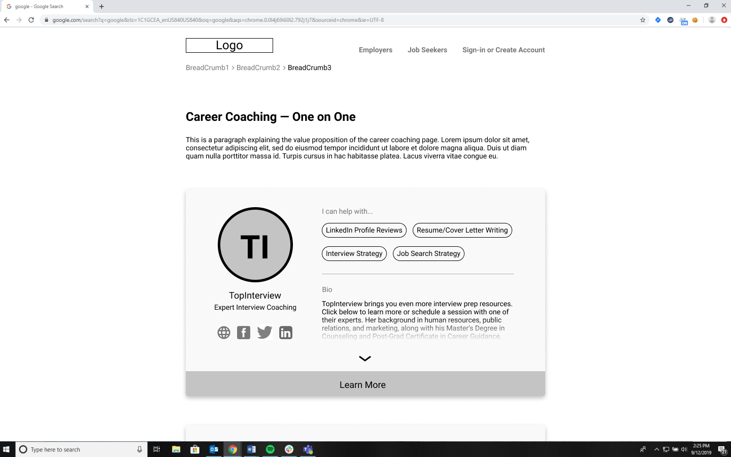
Problem: With the legacy Career Coaching page, there is a lot of scrolling and skimming through large chunks of text that stand in the way of figuring out which coach is the most relevant to contact.
Solution: The mobile profile page uses a swiping card design to organize the coaches and keep the most important content on the screen to minimize vertical scrolling.
The hierarchy of information begins by introducing the coach and then offers the option to dig deeper. On mobile, this is done with a top-down approach while on desktop I used left to right to accommodate the shape of each screen as well as the order in which users read information on each device. First we see their headshot, name and position followed by any relevant social media links that the coaches wish to include. The "I can help with" section enables users to quickly understand the skill sets offered and to determine if the coach is relevant for them. If interested, users can tap the card to expand the profile, displaying the full coach's bio for further investigation. On mobile, users can easily swipe through the different coaches using the pagination below the card.
The Contact Modal
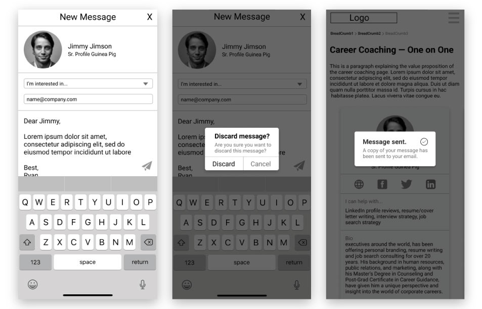
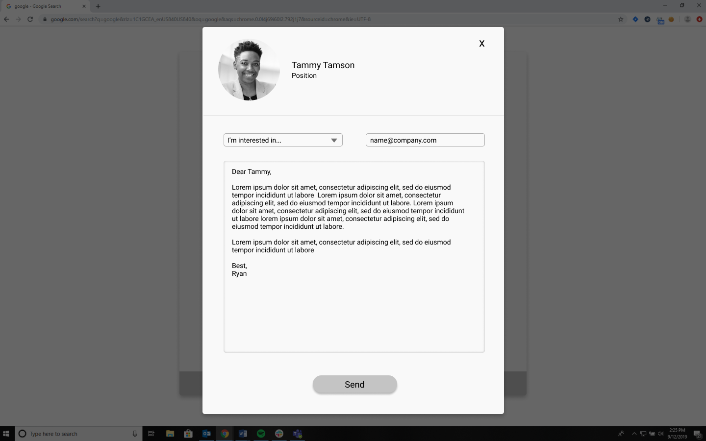
Problem: The legacy design opens the default email app upon tapping the contact button, sending users away from the website and forcing them to switch between apps frequently.
Solution: I decided to use an overlay format for the contact functionality to removing the need for users to go back and forth between email and web browsing apps. This also aims to increase user engagement with the site. The "I'm interested in" dropdown menu is useful for the career coaches as this feature ensures they will always be provided with appropriate subjects which quickly let them know what jobseekers need help with.
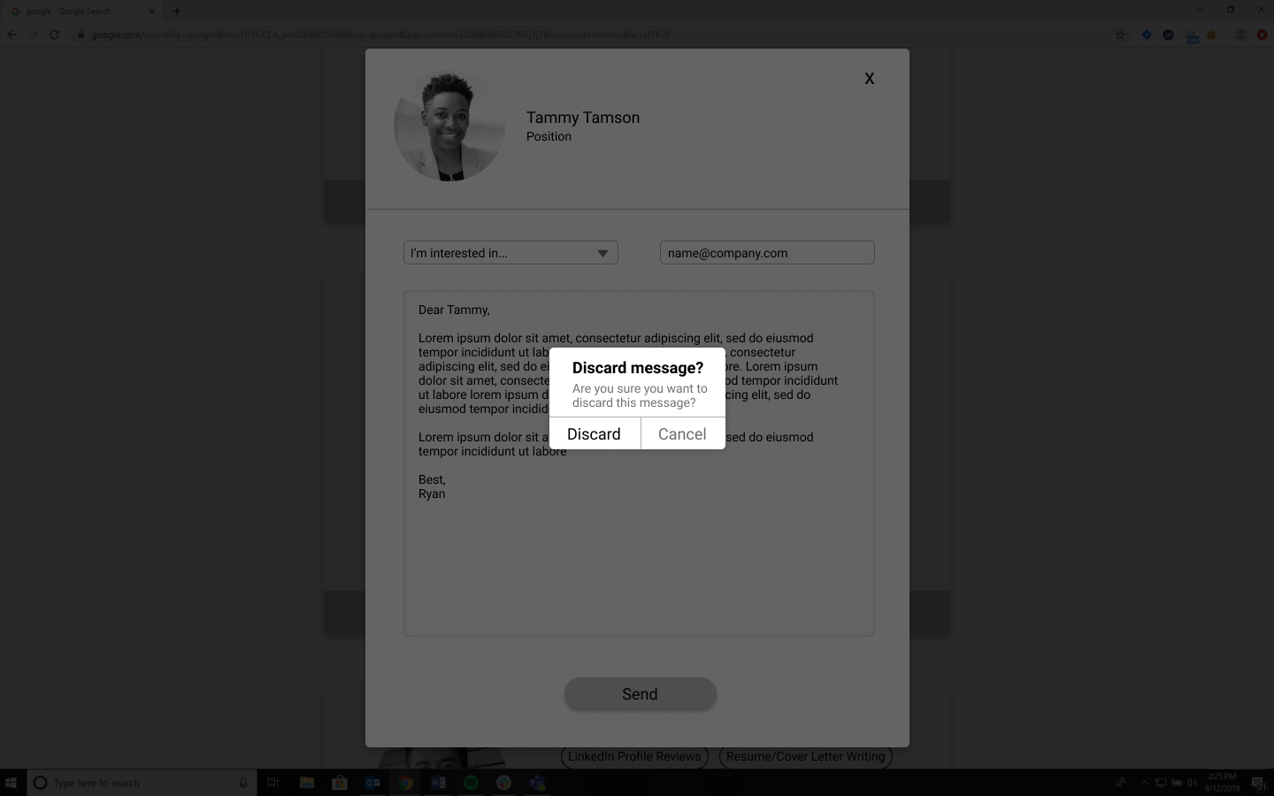
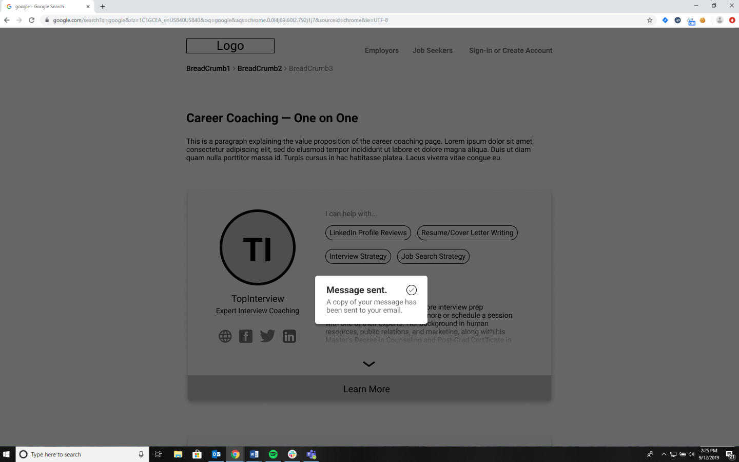
Beyond these features, the contact page is a rather standard format that users will be very familiar with. Once a message is sent, the contact modal will be replaced with a toast notification confirming that their message has been delivered. Tapping or clicking anywhere will remove this notification.
Desktop Version